When designing a home space, the first thing to do is to confirm the color scheme.
Secondly, in the decoration process, we should take into account the principle of color matching for large and small homes. In the general decoration of a house, color selection follows the principle of "overall coordination and local contrast".
The contrasting color design is bright, strong, full of power, and eye-catching. In the design of furniture, the main use of a single color, and other colors are complementary or embellished.
Common colors:
1. Coffee color has many layers and application methods should be combined with light colors as much as possible.
2. Red, orange, and yellow are relatively bright colors, more suitable for young people, and with some cool colors to reduce the feeling of dryness.
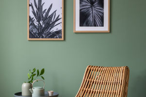
3. Green is calmer and refreshing, and can be matched with some warm colors, try not to match crimson, or black.
4. Blue is usually the first choice for a more calm and composed space and is the best color system to reduce the feeling of dryness.
5. Brown and teal are a more classic style, with a certain elegant atmosphere, and can be combined with some delicate texture or original wood color flooring.
6. Yellow is one of the most eye-catching accent colors in home decoration, if your home is not well-lit, or the overall hard assembly color is too monotonous, adding yellow is a good choice.
Owners who like a more dynamic and jumping style can choose some bright colors to use in the space, increasing the beauty of the lines in the whole space.
The main methods of color matching are similar combinations, contrasting color combinations or complementary color combinations, brightness or purity of monochromatic or multi-color gradient combinations, etc.
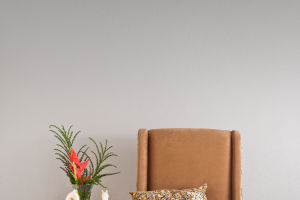
Generally speaking, light tones are soft and romantic, making people feel clean, elegant, and casual; gray tones are noble and solemn; dark tones give people traditional seriousness and classicism.
Tips
1. The wall color matching should not exceed three, otherwise it will look messy.
2. Try to use warm colors in the dining room, red and orange in the visual psychology to increase appetite.
3. The bathroom is best decorated with warm colors, do not use black or dark blue, because the bathroom area is small, and dark colors will look depressing.
4. The color of the ceiling should be lighter than the walls, or the same color as the walls, otherwise it will give people a depressing feeling.